January 2019
Archive
Making content findable again
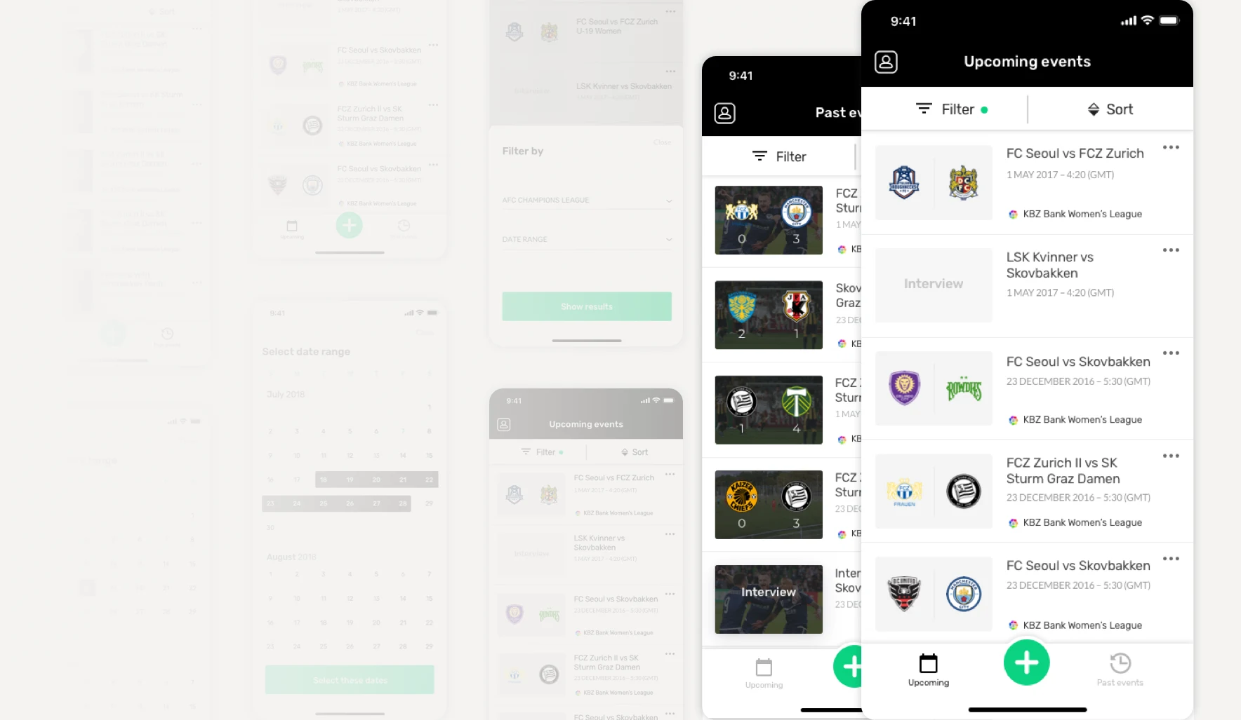
Partners streaming five to seven matches a day had no search and no filters to find scheduled or past events in the MyCujoo broadcast app. Adding filters turned into a light redesign of the app.
- Discipline
- UI/UX design
- Company
- MyCujoo
- Year
- 2019
- Platform
- Mobile app
01
Problem
The app worked and nobody complained, so nobody had questioned its design. But partners couldn't find their events, and the main action sat in the least prominent place on the screen.
02
What I did
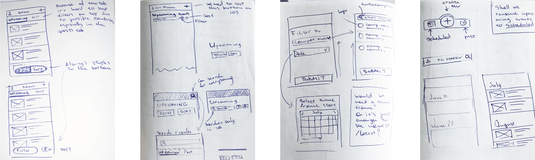
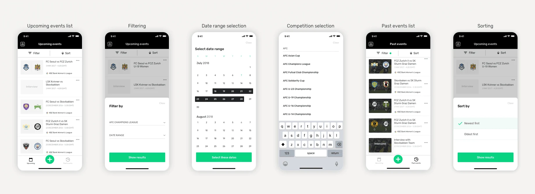
After meetings with the business and customer interviews, we scoped the first iteration. It let partners filter events by date or date range and by competition, and sort them by date of creation.
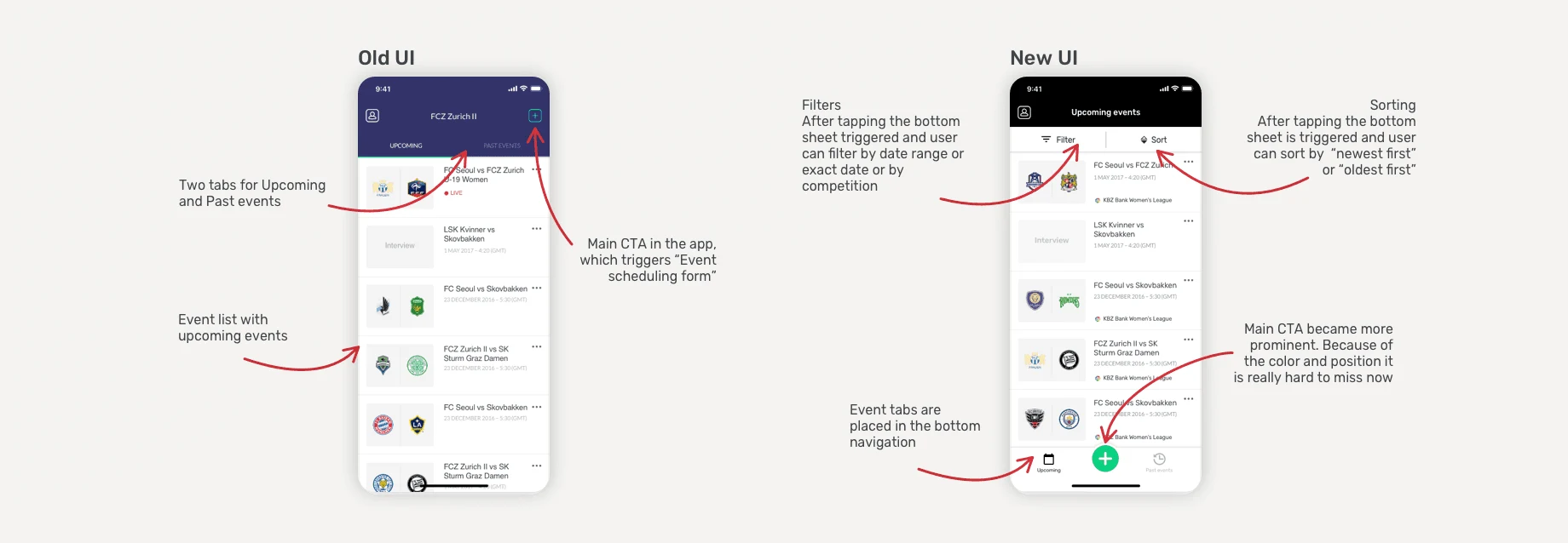
The filters didn't fit into the existing UI, so I moved the Events tab and the main action to the bottom navigation, where they are easy to reach. Filters and sorting open in a bottom sheet, so the app works with one hand. When a filter is on, the filter button lights up.
03
What I learned
Even an app that works is worth questioning. After launch, we collected data on which filters and search terms people used and how long tasks took, to plan the next iterations.