CrowdBuilding
2026
A noticeboard where everyone can post
CrowdBuilding helps people start cooperative housing projects together. Finding each other used to be one-sided. Initiatives listed themselves and waited. A shared bulletin board let home seekers, initiatives, landowners and experts all post what they're looking for.
- Role
- Lead Designer
- Team
- PM, 1 engineer
- Timeline
- About 2 weeks of research and design
- Platform
- Web
01
Impact
- Organic posts since launch
- 80
- Replies on the most popular post
- 63
- Increase in monthly active users
- +11%
One of the goals was to increase engagement on the platform, then tackle retention. The board also gave a voice to people who had no way to speak up before, and showed us what they want.
A man in his 80s offered his estate for communal living for older people. Many people replied to join the project or help, including financing professionals.
02
Context
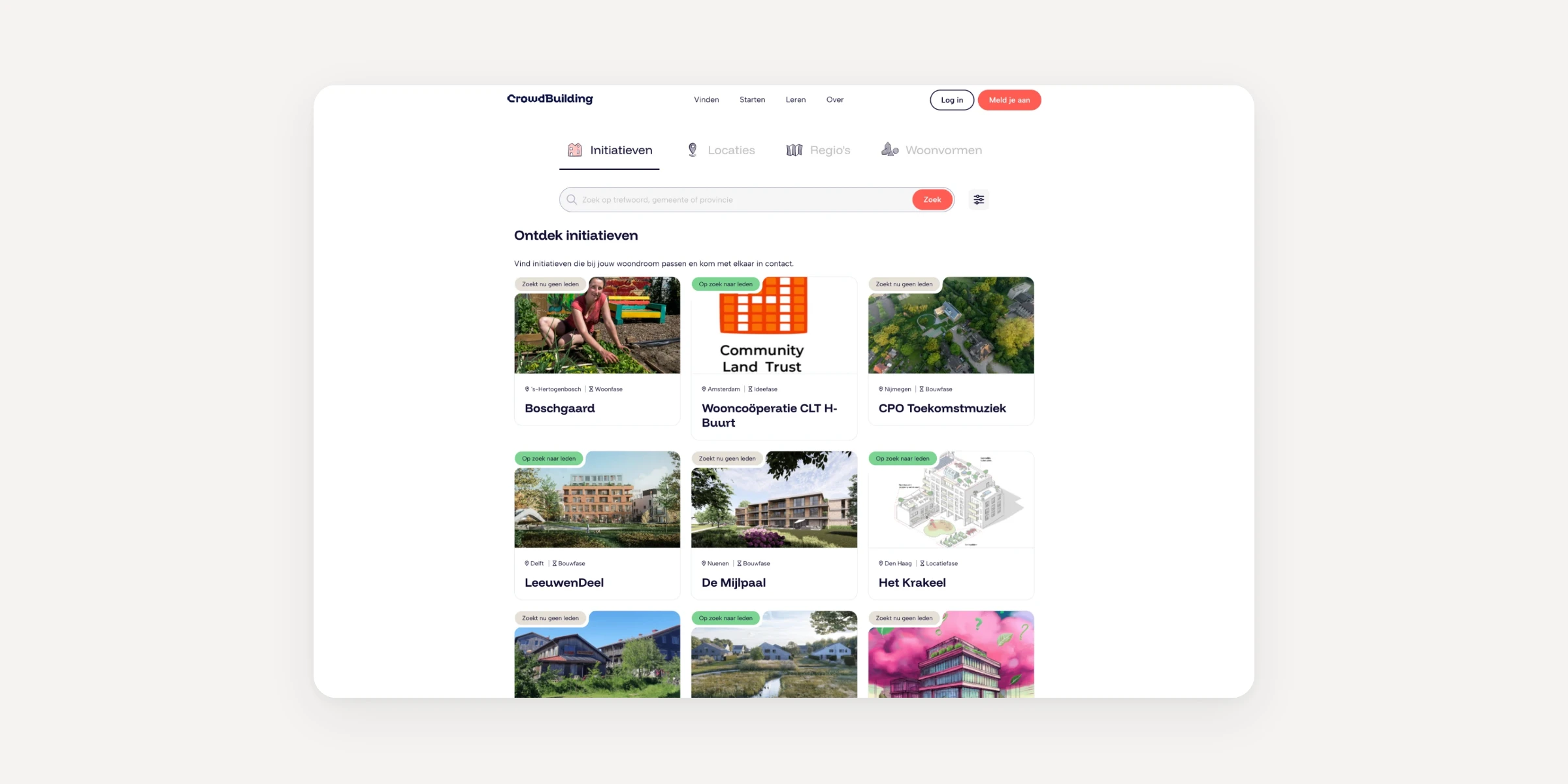
When I joined, CrowdBuilding was a static index of housing initiatives. It was almost impossible to tell whether anything was going on, and if so, what. To know if an initiative was still looking for members, home seekers had to rely on a green label in the corner of its card.
Home seekers had no way to put themselves forward. Someone looking for a cooperative in Amsterdam had to search, filter, and apply to every initiative one by one. Landowners had it worse. To offer a plot, they emailed the team, and someone added it to the CMS by hand.
We knew the platform needed more activity, but not how to get it. One option on the table was more indexes, for plots, experts and home seekers.
03
Problem
Only one side could speak
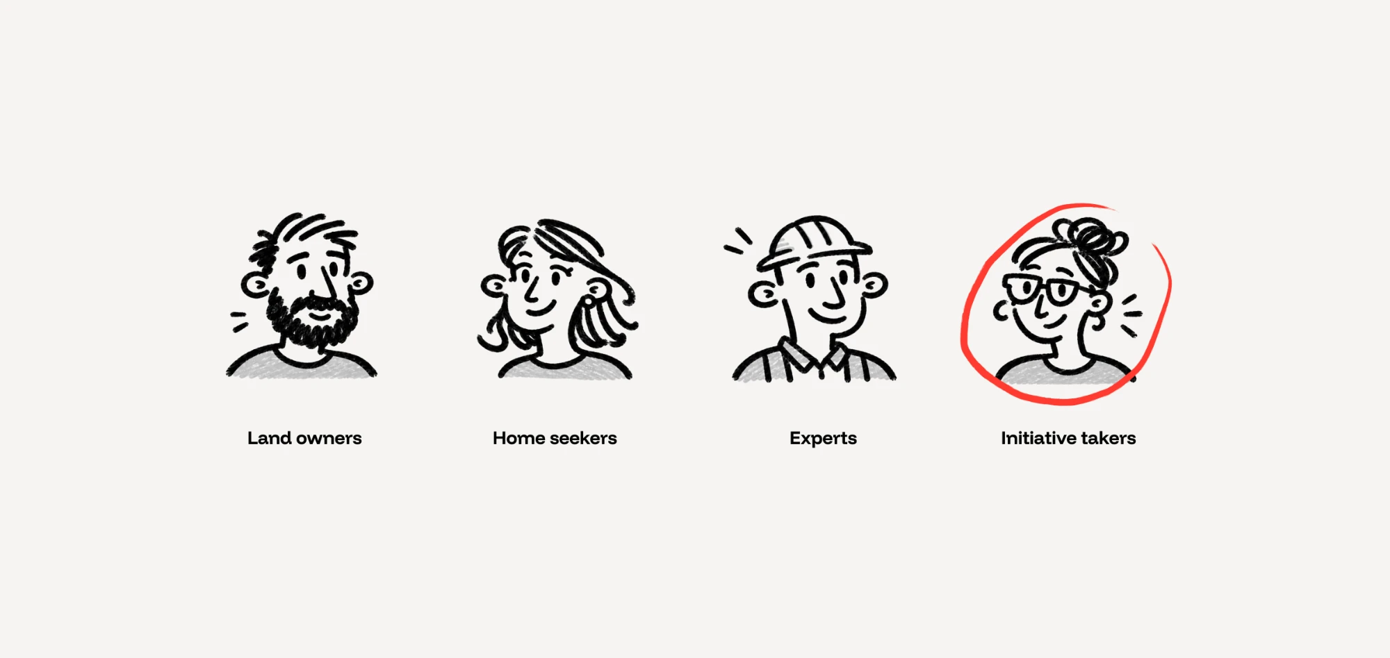
CrowdBuilding is a complex marketplace where four parties need to find each other: initiative takers, home seekers, landowners and experts, such as architects and process managers. The platform let only one of them speak, so initiative takers carried the whole job of driving a project, finding people and finding land.
A noticeboard where all four groups can post shares that work between them, and lets them find each other through what they post, which an index can't do.
Constraints
- Time. The board was a test of whether people would start conversations and come back. Nobody wanted to invest months before we knew, so it had to ship in two weeks.
- An older audience. Many of our users are in their sixties and older, so they had to be able to post without help.
04
Method
Research, prototype, ship, repeat
I interviewed initiative takers about how they scout for members, and home seekers about how they discover cooperatives and try to join one. I also observed users during other research sessions.
To see what people post when nothing stops them, I spent a lot of time on a Dutch website about communal living, where people advertise apartments in cooperatives and look for members.
Later I built a proof of concept in Claude Code and walked a couple of users through it. After their feedback, I made the final designs and handed them to engineering.
05
Trade-offs
Lean by design
7 tags vs 50 filters
Some stakeholders wanted detailed filters for every case. Product and I argued against it. We didn't know yet what people would post, so we couldn't predict which filters they'd need, and we expected few posts.
My first proposal was no filters at all, with categories added once we saw real posts. We settled on seven tags, such as Looking for members, Home offered and Question. People pick them when posting, and the same tags work as filters, along with a filter by province.
Trade-off: people can't always find an exact match. At this volume that matters little, and browsing keeps people on the site longer.
Board vs feed
Instead of a plain feed, posts sit in a grid, three to a row, like a real bulletin board. Each card takes the color of its tag, so a call for members, a request for expertise, a question and an update each get their own soft pastel. Over time people learn to skim past what isn't for them, without touching a filter.
Trade-off: a grid is visually busier than a feed, which can hurt discoverability. The color coding is there to offset that.
Reach vs simplicity
People can also post their message to other noticeboards, such as an initiative's page, with one toggle while creating the post.
Trade-off: posting in more places increases a post's reach, but makes creating a post more complex.
06
Assumptions
What we got wrong
We assumed opening the board to everyone would flood it with posts.
What happened It didn't. Activity was steady, not overwhelming, with 80 posts since launch and hundreds of comments on them.
What changed It confirmed the case for light filtering. At this volume, people can browse the whole board and see every post.
We assumed most posts would come from people looking for a home.
What happened Plenty of home seekers did post. But we were surprised by how many people wanted to develop their land into housing, such as turning farmland into homes, and how many invited others to join their projects.
What changed New initiatives started on the board, which made it more valuable to CrowdBuilding than we expected.
We assumed a simple interface would be enough for everyone to post on their own.
What happened Even with a simple flow, some older users couldn't work out how to post. Our support team ended up walking them through it over the phone.
What changed This audience needs guidance, and a short flow alone isn't enough. Adding guidance to post creation is now first on my list.
We assumed people would keep their contact details for private messages.
What happened Many people left phone numbers, email addresses and even home addresses in public comments.
What changed We shipped a check that spots phone numbers and email addresses and offers to send them as a private message instead. You can see it below.
07
Solution
We shipped a simple post creation flow, an overview of all posts, and a post overlay where people can like, comment, share and reply to other comments.
A couple of days after launch, we shipped a quick fix to protect users' privacy, because people were sharing their personal details everywhere. With this age group, I should have seen it coming.
For such a simple interface, it had a large effect on engagement and retention.
08
Reflection
What I'd do differently
I'd design for personal information from the start, instead of fixing it after launch. With an older audience, people sharing contact details in public was predictable.
I'd also give people more guidance when creating a post. One idea is to let people pick a few tags and have AI draft the post for them to edit.