Profile page revamp

Creating a progress hub for Relive users

The main goal was to make it easier for users to track their progress and better understand their fitness stats. As a bonus, the updated design also helped simplify the UI and reduced the cognitive effort needed to navigate the different stats and features.

Company

Relive

Date

October 2021

Project duration

1 Week

App Screen with open sidebar

The problem

As a product, Relive wanted to give it's users an insight into how they are doing from the fitness perspective because, after dozens of user interviews, we understood that the only person our users want to compete with is themselves. However, when you work in a fast-paced organisation with several independent product teams chasing their objectives, you inevitably will find things and features scattered across the product. It was the case with the stats we offered. There were several pages where users could access different stats and several user flows where these stats would appear.

The method

At the beginning of every project I do, I ask what is the outcome I am designing for. This project wasn't an exception. Together with my PM and PA, we identified how success might look like. Because it wasn't a high-impact bet and frankly, it was a nice-to-have thing, we agreed that if this solution doesn't hurt safety metrics, we would keep it. 
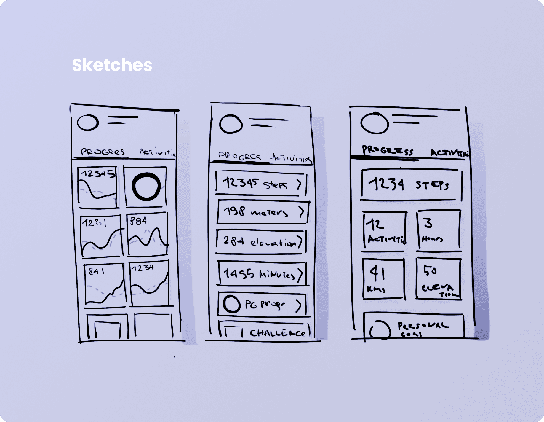
So I went to the drawing board and started sketching. For projects like this one, I like to use the method of extremes - you have to design the 10x experience, then the most minimal experience possible and then land on a golden middle. 
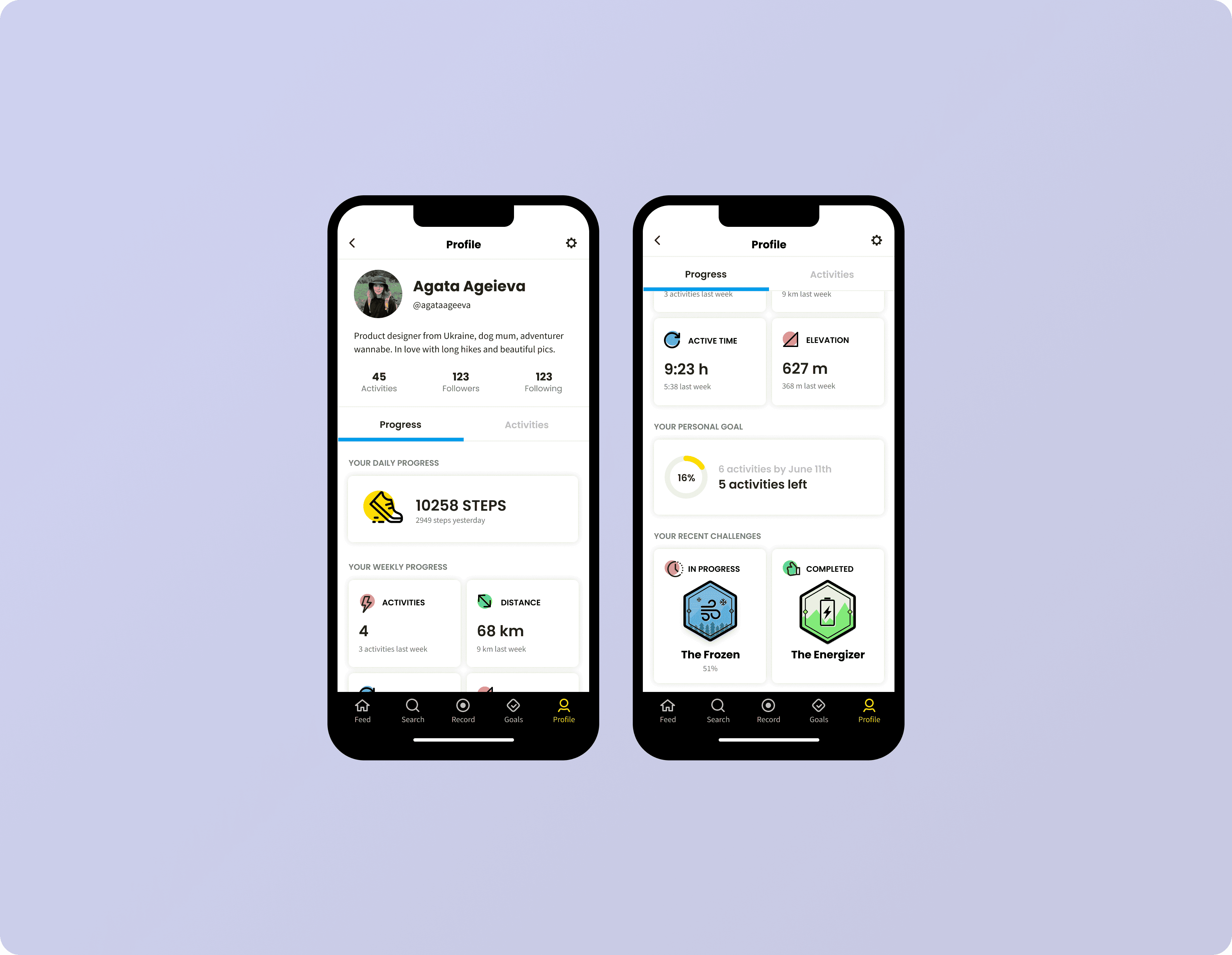
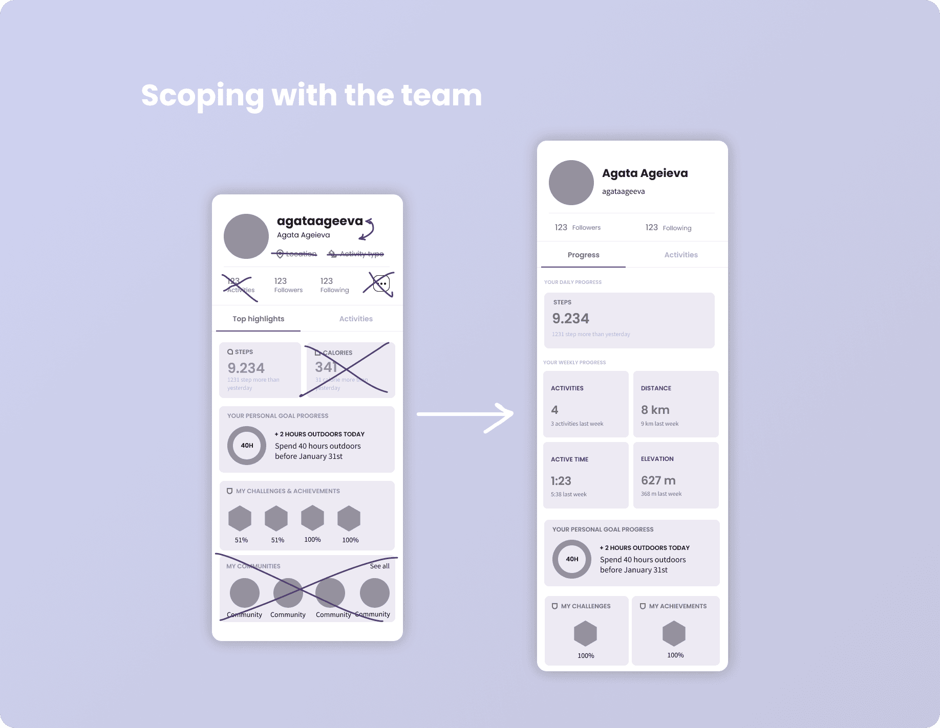
After discussing the sketches I quickly put together a wireframe which was scoped by the engineers. And based on their feedback about what is possible and what is not, given our appetite for this project, I started working on the UI.

Homescreen with open bottom drawer

App Measure Weight Screen

Design

I chose to keep the UI modular because Relive is a startup which is still figuring things out. This means that some new things might be added, and others could be removed. Because it is not a high-impact page, we wanted to spend less time on it when and if we decide to introduce some changes.

Outcome

We had this design running as an AB test for some time. As mentioned above, the agreement we had as a Product Trio was that if our changes didn't hurt safety metrics, we would keep it. It didn't hurt any metrics, besides engagement with the user's own activities, which we fixed in the next iteration.

Even though we didn't notice any positive impact on things like retention or growth, we saw that users spend more time on the progress tab of the profile page, and more users go deeper into the stats.

Say hi at agata.ageieva@gmail.com

Say hi at agata.ageieva@gmail.com

Say hi at agata.ageieva@gmail.com